 Parish Planner
Brand
Growing parish life, together.
Parish Planner is the umbrella over every product on this platform: Mass intentions, volunteers, music, and what comes next. One organization, one account, every product on one apex. The look is a planner's: cool grays, navy for what you press, and a sunrise mark.
The mark
Two interlocking P shapes drawn as one continuous rounded path, filled with the sunrise gradient: magenta at the top left through orange to yellow at the bottom right. The gradient is the mark's alone; interface color never uses it. On dark backgrounds the mark stays as it is.

- Flatten the gradient to one color.
- Outline, stretch or rotate it.
- Set it on a busy photo.
- Use it as an icon inside the interface.

The cover
The mark opened out into a banner for a hero or a card. It bleeds off the top and right of a surface-colored container, with the name set against the surface on the left. Drawn in code from the tokens, so it follows the theme.
Color
Each color has a light and a dark value. Grays are cool: the app points Tailwind's zinc scale at slate, so every gray carries a little blue. Parish Planner is the one brand on the platform with cool grays.
Text, headings, and primary buttons.
Links and the current page. The brand orange lifted so it passes contrast on white; the orange itself returns in dark mode. Never a button fill.
The background of public and quiet pages: sign-in, error pages, email, and this page.
The admin side, and cards, inputs and the email letter on the surface.
Secondary text: descriptions, captions, footers.
Borders and dividers: card edges, table rows, the footer rule.
Orange at full strength fails contrast as text and reads as a warning as a fill. The brand orange marks what you read or follow, lifted to ember on light surfaces. The sunrise gradient appears only in the mark.
Sign-in, error pages and email sit on the surface. The admin side stays white.
Type
Headings at semibold. Parish Planner is the working side of the platform, so it reads like an application, not a brochure.
Everything else: body text, labels, buttons and tables. Email falls back to the system sans.
Voice
- Plain and direct, the way an office manager explains a procedure. Short sentences.
- Say "organization", never "parish" alone: schools, oratories and religious communities use this too. Say "requester" for the person who asks for a Mass.
- Emails greet the person by first name. Use the present tense for what's coming and the past tense for what happened.
- No em dashes in interface copy. An en dash is fine between two dates.
- The slogan is always "Growing parish life, together.", with the comma and the period.
Whose brand
Administrators see Parish Planner itself: the mark and name in the sidebar, every product the organization holds. Requesters and volunteers more often meet the product's own brand. When they land here, public pages lead with the organization's name and end with "Made with Parish Planner".
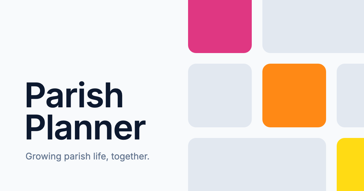
Every page carries link-preview tags with this card, so a link pasted into an email, a text or the bulletin previews with the page title and the organization's name.